GIS3015

Thursday, April 17, 2014
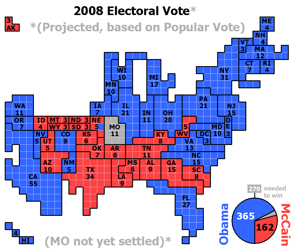
Cartogram

A cartogram map is scales the area of each country in proportion to its population. This map of the United States shows the projected popular vote in the 2008 election.

http://upload.wikimedia.org/wikipedia/commons/2/22/Cartogram-2008_Electoral_Vote.gif
Posted by Unknown at 6:32 AM
Email ThisBlogThis!Share to XShare to FacebookShare to Pinterest

No comments:

Post a Comment

Newer Post Older Post Home
Subscribe to: Post Comments (Atom)

About Me

Unknown
View my complete profile

Blog Archive

  • ▼  2014 (50)
    • ▼  April (50)
      • Stem and Leaf Plot
      • Box Plot
      • Histogram
      • Parallel Coordinate Graph
      • Triangular Plot
      • Windrose
      • Climograph
      • Population Profile
      • Scatterplot
      • Index Value Plot
      • Lorenz Curve
      • Bilateral Graph
      • Nominal Area Choropleth Map
      • Unstandardized Choropleth Map
      • Standardized Choropleth Map
      • Univariate Choropleth Map
      • Bivariate Choropleth Map
      • Unclassed Choropleth Map
      • Classed Choropleth Map
      • Range Graded Proportional Circle Map
      • Continuously Variable Proportional Circle Map
      • DOQQ
      • DEM
      • DLG
      • DRG
      • Isopleth
      • Isopach
      • Isohyets
      • Isotachs
      • Isobars
      • LIDAR
      • Doppler Radar
      • Black and White Aerial Photo
      • Infrared Aerial Photo
      • Cartographic Animation
      • Statistical Map
      • Cartogram
      • Flow Map
      • Isoline Map
      • Proportional Circle Map
      • Choropleth Map
      • Dot Distribution Map
      • Propaganda Map
      • Hypsometric Map
      • PLSS Map
      • Cadastral Map
      • Thematic Map
      • Topographic Map
      • Mental Map
      • Planimetric Map
Ethereal theme. Powered by Blogger.