 http://mainland.cctt.org/mathsummer/josephbond/stemandplots/images/table2.gif
Thursday, April 17, 2014
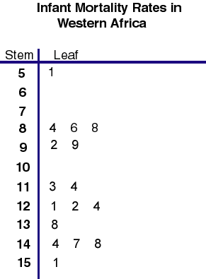
Stem and Leaf Plot
Below is a stem and leaf plot showing infant mortality rates in Western Africa. A stem and leaf plot is a plot where each data value is split into a leaf and a stem.
http://mainland.cctt.org/mathsummer/josephbond/stemandplots/images/table2.gif
http://mainland.cctt.org/mathsummer/josephbond/stemandplots/images/table2.gif
Box Plot
Below is a box plot that shows the annual snow depth at Mathsville Skit Resort. The box plot shows the minimum, first quartile, median, third quartile, and maximum of snow depth.
 https://blogger.googleusercontent.com/img/b/R29vZ2xl/AVvXsEhqWu22YmScW6h43mIYrihd8bHcvfiVtHcBCWI3K9hAwjFNRibZMazVc14zVHxc70hTToO75Q6TuwDca55ZVpnX-eLKwp6MgtAovMeMWHb-GsAlgBkKmGED9X0O1cVewg-kwob1jqsB5Mc/s1600/boxplot-2.jpg
https://blogger.googleusercontent.com/img/b/R29vZ2xl/AVvXsEhqWu22YmScW6h43mIYrihd8bHcvfiVtHcBCWI3K9hAwjFNRibZMazVc14zVHxc70hTToO75Q6TuwDca55ZVpnX-eLKwp6MgtAovMeMWHb-GsAlgBkKmGED9X0O1cVewg-kwob1jqsB5Mc/s1600/boxplot-2.jpg
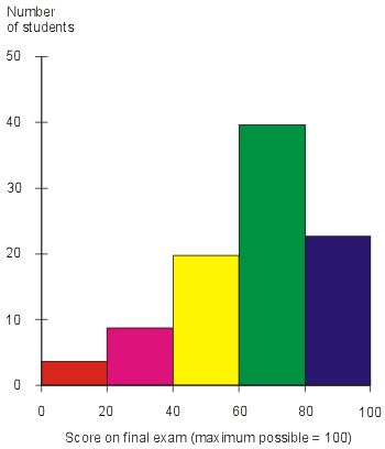
Histogram
The histogram below shows the number of students that scored between a certain score on their exam. A histogram is a diagram that uses rectangles who area is proportional to the frequency of a variable and whose width is equal to the class interval.
 http://cdn.ttgtmedia.com/digitalguide/images/Misc/iw_histogram.gif
http://cdn.ttgtmedia.com/digitalguide/images/Misc/iw_histogram.gif
Parallel Coordinate Graph
A parallel coordinate plot maps each row of data as a line. Each attribute of a row is represented by a point on the line. The parallel coordinate plot below maps a person political preference by age, education, work, race and sex.
 http://static2.xlstat.com/img/tutorials/xpcor3.gif.pagespeed.ic.kzKetCNo53.jpg
http://static2.xlstat.com/img/tutorials/xpcor3.gif.pagespeed.ic.kzKetCNo53.jpg
Triangular Plot
A triangular plot depicts three variables as positions in a triangle. The soil texture plot below shows the percent of different materials that make up soil texture.
 https://blogger.googleusercontent.com/img/b/R29vZ2xl/AVvXsEjZMELzbP6rKB0tUEqfF3WEqnXEETMACzOK9JbId4U29CyTzi4Mh83DhQS0nYHvgnlWEgs3MBbwOUwd1BOTK_ebFeKrxYF6mFZcnzfmMO7e-Ue4RJ-v9LN8TsDZ6ZwCCPkZDCD4gK0OFVfo/s1600/triplot.png
https://blogger.googleusercontent.com/img/b/R29vZ2xl/AVvXsEjZMELzbP6rKB0tUEqfF3WEqnXEETMACzOK9JbId4U29CyTzi4Mh83DhQS0nYHvgnlWEgs3MBbwOUwd1BOTK_ebFeKrxYF6mFZcnzfmMO7e-Ue4RJ-v9LN8TsDZ6ZwCCPkZDCD4gK0OFVfo/s1600/triplot.png
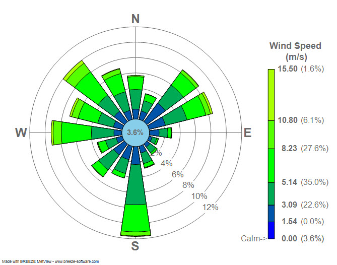
Windrose
Wind rose is used by meteorologists to show wind speed and direction at a particular location. The wind rose plot below shows the wind speed and direction for LaGuardia Airport in New York.
 http://upload.wikimedia.org/wikipedia/commons/7/70/Wind_rose_plot.jpg
http://upload.wikimedia.org/wikipedia/commons/7/70/Wind_rose_plot.jpg
Climograph
A climograph shows monthly average temperature and precipitation at a certain location. Below is a climograph for Boulder, Colorado.
 https://blogger.googleusercontent.com/img/b/R29vZ2xl/AVvXsEg50xjP482VsuLJpsAzyi3JSn7S_cMEaOLBXOLB8XPIHLoMQD2IiJ4c28qyODCfKYsondZFLi8CoVovuumLU_Y5u4rl6TWghT1un9-jXKOz5KR7M3b44Zzgg2sd7-rD4m3TI1QGw6LyKwit/s1600/climograph.gif
https://blogger.googleusercontent.com/img/b/R29vZ2xl/AVvXsEg50xjP482VsuLJpsAzyi3JSn7S_cMEaOLBXOLB8XPIHLoMQD2IiJ4c28qyODCfKYsondZFLi8CoVovuumLU_Y5u4rl6TWghT1un9-jXKOz5KR7M3b44Zzgg2sd7-rD4m3TI1QGw6LyKwit/s1600/climograph.gif
Population Profile
A population profile is a chart that shows the number of people by age. Below are population profiles that show rapid growth in Kenya, slow growth in the United States, and negative growth in Germany.
 https://blogger.googleusercontent.com/img/b/R29vZ2xl/AVvXsEjcWyD-BInQGgmfmu36fdbJdg9t1r7BPXOiLEIdg1yoJSuPwWsSgU72sLfspYVfNYbEmOr1DFdMiej-uCQKBhgzFQzwdCwE5JreNlfvPLpYrEG6u1YnhtzNyXZH6uycLzOz2e52_XEBXew/s1600/pop+pyramids.gif
https://blogger.googleusercontent.com/img/b/R29vZ2xl/AVvXsEjcWyD-BInQGgmfmu36fdbJdg9t1r7BPXOiLEIdg1yoJSuPwWsSgU72sLfspYVfNYbEmOr1DFdMiej-uCQKBhgzFQzwdCwE5JreNlfvPLpYrEG6u1YnhtzNyXZH6uycLzOz2e52_XEBXew/s1600/pop+pyramids.gif
Scatterplot
A scatter plot is a graph where the values of two variables are plotted along two axes, the pattern of the resulting points can reveal correlation. The scatter plot below shows the correlation between hours of study and a person's regents score.
 http://www.regentsprep.org/regents/math/algebra/ad4/scattergraph.gif
http://www.regentsprep.org/regents/math/algebra/ad4/scattergraph.gif
Index Value Plot
In an index value plot an index value is plotted on a line graph. The index value plot below shows the monthly values for the AMO index from 1856-2009.
 https://blogger.googleusercontent.com/img/b/R29vZ2xl/AVvXsEglqv7VtZG2dmXXGcnqKVcf4zjDt6VAl2hUTB6AAFNQU70ojhVp6NqMbi4VcfPTl-fP56f3CbAOoKZ1OBvRXAwFrNLQs-n76fGXXf8CqI_WJVtumJ77r173XjDXZVCUWUqKYFp4VwPmO-Y/s1600/Index+Value+Plot.png
https://blogger.googleusercontent.com/img/b/R29vZ2xl/AVvXsEglqv7VtZG2dmXXGcnqKVcf4zjDt6VAl2hUTB6AAFNQU70ojhVp6NqMbi4VcfPTl-fP56f3CbAOoKZ1OBvRXAwFrNLQs-n76fGXXf8CqI_WJVtumJ77r173XjDXZVCUWUqKYFp4VwPmO-Y/s1600/Index+Value+Plot.png
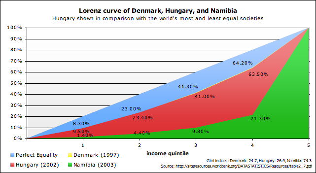
Lorenz Curve
A Lorenz curve is a graph where the cumulative percentage of total national income is plotted against the cumulative percentage of the corresponding population. The Lorenz curve below shows Hungary shown in comparison with the world's most and least equal societies.
 http://upload.wikimedia.org/wikipedia/commons/5/57/Lorenz_curve_of_Denmark,_Hungary,_and_Namibia.png
http://upload.wikimedia.org/wikipedia/commons/5/57/Lorenz_curve_of_Denmark,_Hungary,_and_Namibia.png
Bilateral Graph
Bilateral graphs compare two or more sets of data in a visual graph. The bilateral graph below compares acceptance of trainees, dispatch of experts, and dispatch of JOCV's from 94-98.
 https://blogger.googleusercontent.com/img/b/R29vZ2xl/AVvXsEhbh8pV3mbKqlV2pM7jaj_zDK1Gc4XF07-_HkGoVpH5LatHEPxOk7gOgovz23bQuN7BFEWbRRSIfnRpNomg72EEl0REIA1F5cbuN7RqRcoSjFd0SSkm5Dr35xMn5_JmuRApBp_I65qMMyJn/s400/bilateral+graph.gif
https://blogger.googleusercontent.com/img/b/R29vZ2xl/AVvXsEhbh8pV3mbKqlV2pM7jaj_zDK1Gc4XF07-_HkGoVpH5LatHEPxOk7gOgovz23bQuN7BFEWbRRSIfnRpNomg72EEl0REIA1F5cbuN7RqRcoSjFd0SSkm5Dr35xMn5_JmuRApBp_I65qMMyJn/s400/bilateral+graph.gif
Nominal Area Choropleth Map
Nominal area choropleth maps display nominal data over a specified region. The nominal area choropleth map below shows he minority group with the highest percent of state population.
 https://courseware.e-education.psu.edu/courses/geog482/graphics/citationexample.jpg
https://courseware.e-education.psu.edu/courses/geog482/graphics/citationexample.jpg
Unstandardized Choropleth Map
An unstandardized choropleth map is a map that is unordered, where there is no specific ranking assigned to each category. The unstandradized choropleth map below shows what counties in North Carolina have more complete architectural surveys.
 http://irvinecatalogs.blogspot.com/2011/07/unstandardized-choropleth.html
http://irvinecatalogs.blogspot.com/2011/07/unstandardized-choropleth.html
Standardized Choropleth Map
Standardized choropleth maps normalize data according to a certain area so that areas of varying size can be compared to one another. Below is a standardized choropleth map that shows population per square mile by state in 2000.
 https://blogger.googleusercontent.com/img/b/R29vZ2xl/AVvXsEgEHMCy8sFEYl2-S0-FKVNXst1vxi_5DBranJ2RABj7BtcdPlZUVjMfihKRNJ1oSkr1k4SsNtIblt4el45d-KSoSbh6z-O3d1q010v4IMVdqWNCXrFjpaBBP9kA79T9vaRM9Sz2AwkZLnE/s1600/standardized+c+map.PNG
https://blogger.googleusercontent.com/img/b/R29vZ2xl/AVvXsEgEHMCy8sFEYl2-S0-FKVNXst1vxi_5DBranJ2RABj7BtcdPlZUVjMfihKRNJ1oSkr1k4SsNtIblt4el45d-KSoSbh6z-O3d1q010v4IMVdqWNCXrFjpaBBP9kA79T9vaRM9Sz2AwkZLnE/s1600/standardized+c+map.PNG
Univariate Choropleth Map
A univariate choropleth map is a ma that displays a single set of data. The univariate choropleth map below shows the percent in poverty in the United States.
 https://blogger.googleusercontent.com/img/b/R29vZ2xl/AVvXsEguIbJQw51NEoeXfi1b_Yc_rG7EFKYDm6Gk7hLH5LWhtnY-MIWEnwg4BzQoepDXpGZAKx2cOOCpJsGs6U9zxDAnbCDVlNtsK5kItNSxa5gDtr4OZQ1bo0Es_M2rTTL7Hf4my5MrH1y2yN_D/s1600/2008PovertyCountiesMapfour.jpg
https://blogger.googleusercontent.com/img/b/R29vZ2xl/AVvXsEguIbJQw51NEoeXfi1b_Yc_rG7EFKYDm6Gk7hLH5LWhtnY-MIWEnwg4BzQoepDXpGZAKx2cOOCpJsGs6U9zxDAnbCDVlNtsK5kItNSxa5gDtr4OZQ1bo0Es_M2rTTL7Hf4my5MrH1y2yN_D/s1600/2008PovertyCountiesMapfour.jpg
Bivariate Choropleth Map
A bivariate map displays the relationship ship of two variables. The bivariate map below shows the difference between voter percentage difference in 2004 US presidential election as related to voter turnout.
 http://upload.wikimedia.org/wikipedia/commons/f/fc/2004US_election_map.jpg
http://upload.wikimedia.org/wikipedia/commons/f/fc/2004US_election_map.jpg
Unclassed Choropleth Map
An unclassed choropleth map shows statistical data in a multi-colored values using lighter colors to portray smaller values and darker colors to portray greater values. The unclassed choropleth map below shows the 2004 Presidential Election. The red stands for percentage republican and the blue stands for percentage democrat.
 https://blogger.googleusercontent.com/img/b/R29vZ2xl/AVvXsEiZvyNtM8gXpCNIKiFkAUDlqDXXkHLZjn91Z1l68aPC3UJaNACBABqlFxkQ9vPDvK-VG3ZW8qBn3XMyAybm0P7Rukr1UVAZCB8z-15YETEsZdn9vQxvuTtfgENkd7joYcy0v5fpBrukiY1B/s1600/purple_america_2004_small.gif
https://blogger.googleusercontent.com/img/b/R29vZ2xl/AVvXsEiZvyNtM8gXpCNIKiFkAUDlqDXXkHLZjn91Z1l68aPC3UJaNACBABqlFxkQ9vPDvK-VG3ZW8qBn3XMyAybm0P7Rukr1UVAZCB8z-15YETEsZdn9vQxvuTtfgENkd7joYcy0v5fpBrukiY1B/s1600/purple_america_2004_small.gif
Classed Choropleth Map
A classed choropleth map uses different shades of color to determine different measure of a value. The classed choropleth map below shows amount in tons of 1992 beef cattle emissions in North Carolina.
 https://blogger.googleusercontent.com/img/b/R29vZ2xl/AVvXsEhFO78RX_9bQAtJs0XstsyQWvke4MFxEqKWg6jjStGK7GaYwG8zHO-i5CTSSk75Ik1CTvtNfvYW30C8w8WElpGtNJoXkl1Rn_K7ASvOAmRZuxD7VwPCpBGY2_kxWEt29fU89HSgLliL2wOG/s1600/beefmethaneJMK.gif
https://blogger.googleusercontent.com/img/b/R29vZ2xl/AVvXsEhFO78RX_9bQAtJs0XstsyQWvke4MFxEqKWg6jjStGK7GaYwG8zHO-i5CTSSk75Ik1CTvtNfvYW30C8w8WElpGtNJoXkl1Rn_K7ASvOAmRZuxD7VwPCpBGY2_kxWEt29fU89HSgLliL2wOG/s1600/beefmethaneJMK.gif
Range Graded Proportional Circle Map
Range graded maps divide use a set number of circles,each circle having a range of values for it's size within the legend. The range graded map below shows the Filipino population in selected states in 2000.
 https://blogger.googleusercontent.com/img/b/R29vZ2xl/AVvXsEguwDr4NZKhw3NB54ecyOan-tvdHBk9PQfbjzt2KnFTdRyQWXSlpJU01WhuA0Tn9iS7NOyUesVShFbvPlrJIPgOyjau-mvLhCU_IBOOqe1HAl6CQtKifVYmE2WHeuHGkxgCX5IzVNgEfJU/s1600/proportional_circle.jpeg
https://blogger.googleusercontent.com/img/b/R29vZ2xl/AVvXsEguwDr4NZKhw3NB54ecyOan-tvdHBk9PQfbjzt2KnFTdRyQWXSlpJU01WhuA0Tn9iS7NOyUesVShFbvPlrJIPgOyjau-mvLhCU_IBOOqe1HAl6CQtKifVYmE2WHeuHGkxgCX5IzVNgEfJU/s1600/proportional_circle.jpeg
Continuously Variable Proportional Circle Map
Continuously variable proportional circle maps use circle within a map to represent proportion of data being measured. The continuously variable proportional circle map below shows the major industry in certain areas of West Germany.
 https://blogger.googleusercontent.com/img/b/R29vZ2xl/AVvXsEhftpuNuWIPla-l5owDyQdAbnhQRJmYvGSpfU2YbLSGPkd7wcWLj3qgbWxkkwUDuq7erNeBpzbX58soN3c0F8HnMcn5mvXD8s68pQBi8TDRuCrlK854tr1YoupJN_dMlBDWF-1j5HtEYJol/s1600/west_germany_ind_1972.jpg
https://blogger.googleusercontent.com/img/b/R29vZ2xl/AVvXsEhftpuNuWIPla-l5owDyQdAbnhQRJmYvGSpfU2YbLSGPkd7wcWLj3qgbWxkkwUDuq7erNeBpzbX58soN3c0F8HnMcn5mvXD8s68pQBi8TDRuCrlK854tr1YoupJN_dMlBDWF-1j5HtEYJol/s1600/west_germany_ind_1972.jpg
DOQQ
A digital Orthophoto Quarter Quadranle (DOQQ) is an aerial photo that has been geometrically corrected so the scale of the photograph is uniform. This is done to get an accurate depiction of the area.
 http://www3.nd.edu/~underc/east/maps/documents/UNDERC_DOQQ.bmp
http://www3.nd.edu/~underc/east/maps/documents/UNDERC_DOQQ.bmp
DEM
A digital elevation model (DEM) is a digital representation of an area built using remote sensing. The DEM below shows the Sacramento Valley Elevation.
 http://academic.emporia.edu/aberjame/student/alvarez1/svdem.jpg
http://academic.emporia.edu/aberjame/student/alvarez1/svdem.jpg
DLG
A digital line graph, DLG, is a digital representation of cartographic information. The DLG map below is of Athens, Georgia.
 https://blogger.googleusercontent.com/img/b/R29vZ2xl/AVvXsEiDmgdhOTS2d7l1hpZaCAqMc6zRLDDVTKgB29deX5uQFNjdcjExyefW90QF2UBI9FWpSeuRKCJqgOZ7BHDaQ6Y3623bRgMi01vYsbOvGK4hTj-3kvOGa4_WmaBSCF4Q1Z7YvtswFBuSU_w/s1600/23.gif
https://blogger.googleusercontent.com/img/b/R29vZ2xl/AVvXsEiDmgdhOTS2d7l1hpZaCAqMc6zRLDDVTKgB29deX5uQFNjdcjExyefW90QF2UBI9FWpSeuRKCJqgOZ7BHDaQ6Y3623bRgMi01vYsbOvGK4hTj-3kvOGa4_WmaBSCF4Q1Z7YvtswFBuSU_w/s1600/23.gif
DRG
A digital raster graphic, DRG, is a scanned image of a USGS standard series topographic map that includes all map collar information. The DRG map below shows a part of the Washington West, D.C.
 http://egsc.usgs.gov/isb//pubs/factsheets/fs08801.graphics/drg.jpg
http://egsc.usgs.gov/isb//pubs/factsheets/fs08801.graphics/drg.jpg
Isopleth
Isopleth maps simplify data that is continuously distributed. Shows data as a third dimension on the map. The isopleth map below shows the total precipitation for 1996.
 https://blogger.googleusercontent.com/img/b/R29vZ2xl/AVvXsEjtsGc1yC07_n2cirXXA5XyELHuefBoaWp7Y_vc8Ee_SI5Jl5T6TYHkZ0N6n7Xt5-y3k0NwHxOKeqkzfiu2z9FwGj2imICFmqzQYCvFblLFnYnoDnNzxFer1sWgdvtkMrOkCAUEuOzac6g/s1600/precip1996.gif
https://blogger.googleusercontent.com/img/b/R29vZ2xl/AVvXsEjtsGc1yC07_n2cirXXA5XyELHuefBoaWp7Y_vc8Ee_SI5Jl5T6TYHkZ0N6n7Xt5-y3k0NwHxOKeqkzfiu2z9FwGj2imICFmqzQYCvFblLFnYnoDnNzxFer1sWgdvtkMrOkCAUEuOzac6g/s1600/precip1996.gif
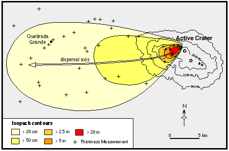
Isopach
Isopach maps connect points of equal thickness in a specific area. The isopach map below shows the Rio Blanco Tephra Deposit.
 http://www.geo.utexas.edu/faculty/barker/kempter/rbtephra.gif
http://www.geo.utexas.edu/faculty/barker/kempter/rbtephra.gif
Isohyets
Isophyet maps have a line joining points of equal precipitation on a map. The isohyet map below shows areas in Australia that have an equal average rainfall annually.
 https://blogger.googleusercontent.com/img/b/R29vZ2xl/AVvXsEitilgB1TtLFPlBJM6SA3fDGhKqOQMldLn-8ZaCQtNmoLgLdhxe3XcYDM2-kaWJrqvw4i38fdDJ1sFfxB4WNBnxewDPtOekyKYul3oGML5FUWBi9XUvcSmOyy1wu4SpPyhX8WOFcRhdUA8/s1600/wa14b.jpg
https://blogger.googleusercontent.com/img/b/R29vZ2xl/AVvXsEitilgB1TtLFPlBJM6SA3fDGhKqOQMldLn-8ZaCQtNmoLgLdhxe3XcYDM2-kaWJrqvw4i38fdDJ1sFfxB4WNBnxewDPtOekyKYul3oGML5FUWBi9XUvcSmOyy1wu4SpPyhX8WOFcRhdUA8/s1600/wa14b.jpg
Isotachs
An isotach map has lines connecting areas where equal wind velocities have been recorded. The isotach map below shows Florida, Georgia, and Alabama's areas of equal wind velocities.
 https://blogger.googleusercontent.com/img/b/R29vZ2xl/AVvXsEgo7unmO-64xhSRRngx3EmE00ZOahxKz1gPGVijC67mjKc1on95yb4RLW1aGc_qXvyrGJKDb78S0GZoc1phvvoPb_d4l44q_Ys4OLB2P0nGi1hkBNFJsPwFVmyWrbxrgLgRo-pzpsIpRr6K/s1600/isotach.jpg
https://blogger.googleusercontent.com/img/b/R29vZ2xl/AVvXsEgo7unmO-64xhSRRngx3EmE00ZOahxKz1gPGVijC67mjKc1on95yb4RLW1aGc_qXvyrGJKDb78S0GZoc1phvvoPb_d4l44q_Ys4OLB2P0nGi1hkBNFJsPwFVmyWrbxrgLgRo-pzpsIpRr6K/s1600/isotach.jpg
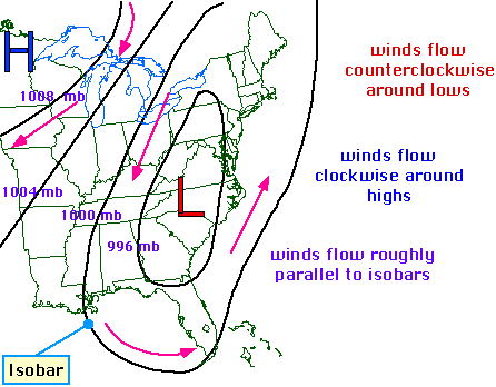
Isobars
Isobar maps have lines that join points of equal pressure. The isobar map below shows the eastern half of the United States and equal pressure levels, as well as an explanation of how the winds flow.
 http://ww2010.atmos.uiuc.edu/guides/maps/sfcobs/cntr/gifs/wind1.gif
http://ww2010.atmos.uiuc.edu/guides/maps/sfcobs/cntr/gifs/wind1.gif
LIDAR
LIDAR map uses light detection and ranging to show topographic data. LIDAR map below shows New York City.
 https://www.leidos.com/sites/default/files/imported/geospatial/images/lidar2.jpg
https://www.leidos.com/sites/default/files/imported/geospatial/images/lidar2.jpg
Doppler Radar
Doppler radar uses sound waves to depict weather patterns. The Doppler radar below was a prediction of how Hurricane Charley would move through Florida.
 http://www.srh.noaa.gov/images/mlb/surveys/charley/HurricaneCharley.gif
http://www.srh.noaa.gov/images/mlb/surveys/charley/HurricaneCharley.gif
Black and White Aerial Photo
Black and white aerial photos are pictures taking in black and white so that landscape features can be more easily understood. This black and white aerial photograph is of the Brooklyn Bridge and NYC skyline.
 http://us.123rf.com/400wm/400/400/thesupe87/thesupe870803/thesupe87080300012/2703361-a-black-and-white-aerial-shot-of-the-famous-brooklyn-bridge-and-nyc-skyline.jpg
http://us.123rf.com/400wm/400/400/thesupe87/thesupe870803/thesupe87080300012/2703361-a-black-and-white-aerial-shot-of-the-famous-brooklyn-bridge-and-nyc-skyline.jpg
Infrared Aerial Photo
Infrared photos are taken with a camera that captures only infrared light. The photo below is of Fort Leavenworth, Kansas and this photo makes it easier to see the density of vegetation growing in the area.
 https://blogger.googleusercontent.com/img/b/R29vZ2xl/AVvXsEjv-ZAa7Usy0uA_I8fY_XTWywc-1kh8o3Q0Y4YSkULLoreBhJvMLeu-Krg2HkoAhyphenhyphenIHwwm2rPKX9pZSWtrAdzEbQLKsdpHU0AWRIkvcTE0qvyBjf0TPqmkvaeK5xZSg5Le7GCDKYTn_CQfu/s1600/aerial+infrared.jpg
https://blogger.googleusercontent.com/img/b/R29vZ2xl/AVvXsEjv-ZAa7Usy0uA_I8fY_XTWywc-1kh8o3Q0Y4YSkULLoreBhJvMLeu-Krg2HkoAhyphenhyphenIHwwm2rPKX9pZSWtrAdzEbQLKsdpHU0AWRIkvcTE0qvyBjf0TPqmkvaeK5xZSg5Le7GCDKYTn_CQfu/s1600/aerial+infrared.jpg
Cartographic Animation
A cartographic animation has moving parts that show what could happen. These are used a great deal in weather forecasting. The animation below shows the potential path of of Hurricane Wilma.
 http://tinypic.com/view.php?pic=fnd7bc&s=4#.U0_YKlVdVu4
http://tinypic.com/view.php?pic=fnd7bc&s=4#.U0_YKlVdVu4
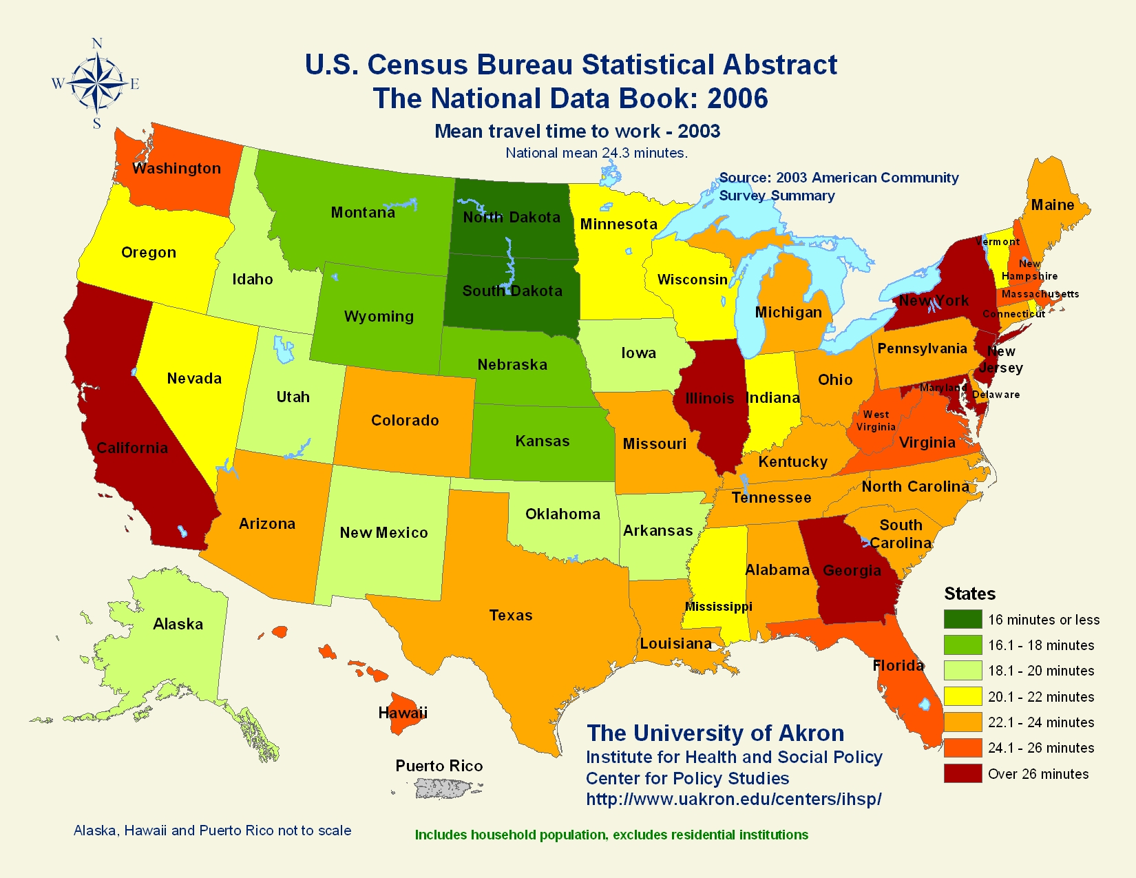
Statistical Map
Statistical maps gives a standard statistic with regards to a specific period of time. The statistical map below shows the mean travel time to work in 2003.
 http://www.mappery.com/maps/United-States-Travel-Time-to-Work-Statistical-Map.jpg
http://www.mappery.com/maps/United-States-Travel-Time-to-Work-Statistical-Map.jpg
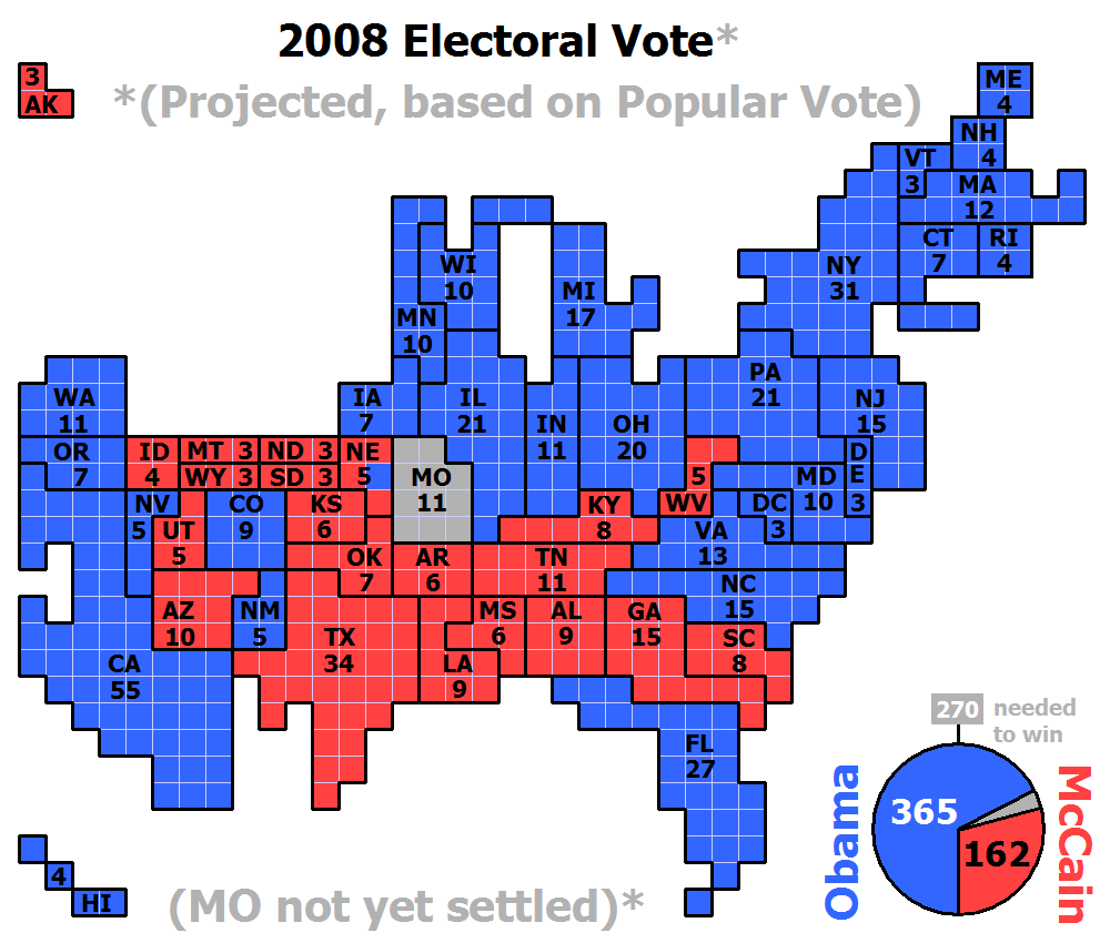
Cartogram
A cartogram map is scales the area of each country in proportion to its population. This map of the United States shows the projected popular vote in the 2008 election.
 http://upload.wikimedia.org/wikipedia/commons/2/22/Cartogram-2008_Electoral_Vote.gif
http://upload.wikimedia.org/wikipedia/commons/2/22/Cartogram-2008_Electoral_Vote.gif
Flow Map
A flow map is used to show the movement of a variable. This map shows the movement truck flows for Texas throughout the US.

http://tomsmapcatalog.blogspot.com/2010/04/flow-maps.html
http://tomsmapcatalog.blogspot.com/2010/04/flow-maps.html
Isoline Map
Isoline maps show three-dimensional models as two-dimensional. This is an isoline map of the mean annual precipitation of Mexico but you can see where the mountains/higher lands are by the image.
 http://www.lib.utexas.edu/maps/atlas_mexico/mean_annual_precipitaion.jpg
http://www.lib.utexas.edu/maps/atlas_mexico/mean_annual_precipitaion.jpg
Proportional Circle Map
Proportional circle maps display data in relation to the size of the circle. This proportional circle map shows the amount of motor vehicle deaths in Florida.
 https://blogger.googleusercontent.com/img/b/R29vZ2xl/AVvXsEglcgJjUuKfEYrgH9Dub7U_buM9wOA-EJSb5i08MqxmptAv22deVwAnGezuNlZncRJAnLSoFbHlsd1IYanGKch8CpUV1Tmal7eYfDMNqDFVDru5hRtg2lvRqJCxbjefsDfiCoNSZk12xbBM/s1600/L07_cg_fig17.gif
https://blogger.googleusercontent.com/img/b/R29vZ2xl/AVvXsEglcgJjUuKfEYrgH9Dub7U_buM9wOA-EJSb5i08MqxmptAv22deVwAnGezuNlZncRJAnLSoFbHlsd1IYanGKch8CpUV1Tmal7eYfDMNqDFVDru5hRtg2lvRqJCxbjefsDfiCoNSZk12xbBM/s1600/L07_cg_fig17.gif
Choropleth Map
Choropleth maps are maps where areas are shaded in proportion of the measurement of the variable being displayed. The Choropleth map below shows number of people per square mile in the United States.
 http://media-2.web.britannica.com/eb-media/89/71789-050-459169A6.gif
http://media-2.web.britannica.com/eb-media/89/71789-050-459169A6.gif
Dot Distribution Map
Dot distribution maps are used to show the presence of a variable with a dot. The dot distribution map below shows the Hispanic population in areas of the US.

https://www.e-education.psu.edu/files/geog482/image/hisp_dots.gif
https://www.e-education.psu.edu/files/geog482/image/hisp_dots.gif
Propaganda Map
A propaganda map is a map that has the goal of achieving a result similar to traditional propaganda. The propaganda map below shows the world according to Ronald Reagan, which is obviously not accurate.
 https://blogger.googleusercontent.com/img/b/R29vZ2xl/AVvXsEjonW0w0AA98j-gvewcPeT9ywJehACHpznLXe0iXrThFqwqRTYydkFfDUb9D7WIkfzxOo2U7dSWySAaFX26n4z4-x0e9Wp4QehGgiq6AFuVY9HgeCmziBMUsGG2EvqVUvdC7TXtzw4akSY/s400/Propaganda+Map.jpg
https://blogger.googleusercontent.com/img/b/R29vZ2xl/AVvXsEjonW0w0AA98j-gvewcPeT9ywJehACHpznLXe0iXrThFqwqRTYydkFfDUb9D7WIkfzxOo2U7dSWySAaFX26n4z4-x0e9Wp4QehGgiq6AFuVY9HgeCmziBMUsGG2EvqVUvdC7TXtzw4akSY/s400/Propaganda+Map.jpg
Hypsometric Map
Hypsometric maps depict the configuration of the earth's surface. The hypsometric map below shows the elevation levels of Africa.
 https://blogger.googleusercontent.com/img/b/R29vZ2xl/AVvXsEih1npc2Gnm7ZwXdc_pHaRinnYIceD9TLcgdPbfsxdu8GbA7X44AXAhr0SXnl9wJrzbmOM4hj90jJsxblvqOmIieLizigvqhFkQCjwr6lGeaSTgQCpz172boUce_8MNoDlnjWg5ODzLGZ4/s1600/afelevation.jpg
https://blogger.googleusercontent.com/img/b/R29vZ2xl/AVvXsEih1npc2Gnm7ZwXdc_pHaRinnYIceD9TLcgdPbfsxdu8GbA7X44AXAhr0SXnl9wJrzbmOM4hj90jJsxblvqOmIieLizigvqhFkQCjwr6lGeaSTgQCpz172boUce_8MNoDlnjWg5ODzLGZ4/s1600/afelevation.jpg
PLSS Map
Public Land Survey System (PLSS) maps show land that is subdivided. The PLSS below is of Northern Florida.
 http://tomsmapcatalog.blogspot.com/2010/04/plss-map.html
http://tomsmapcatalog.blogspot.com/2010/04/plss-map.htmlCadastral Map
Cadastral maps show the boundaries and ownership of land. The Cadastral below is of Delaware County. It depicts each city included in the county's boundaries.

Thematic Map
A thematic map shows geographic patterns in statistical data displayed in color. The thematic map below shows soil moisture regimes of the United States.
 https://blogger.googleusercontent.com/img/b/R29vZ2xl/AVvXsEhy1lESZhYZ81FcqbyjLqjNxbm6yZGAbeVLydobims8xRiGfQE-dKTBf5zcdDXi_alzwCg1OIstFrtmSYe8GumQ3KC1Br5BzTuea3Os8_lG6tHF0i79nRwJRqO6jCRu0hopoqj01NQAGwk/s1600/Tehmatic+Map.jpg
https://blogger.googleusercontent.com/img/b/R29vZ2xl/AVvXsEhy1lESZhYZ81FcqbyjLqjNxbm6yZGAbeVLydobims8xRiGfQE-dKTBf5zcdDXi_alzwCg1OIstFrtmSYe8GumQ3KC1Br5BzTuea3Os8_lG6tHF0i79nRwJRqO6jCRu0hopoqj01NQAGwk/s1600/Tehmatic+Map.jpg
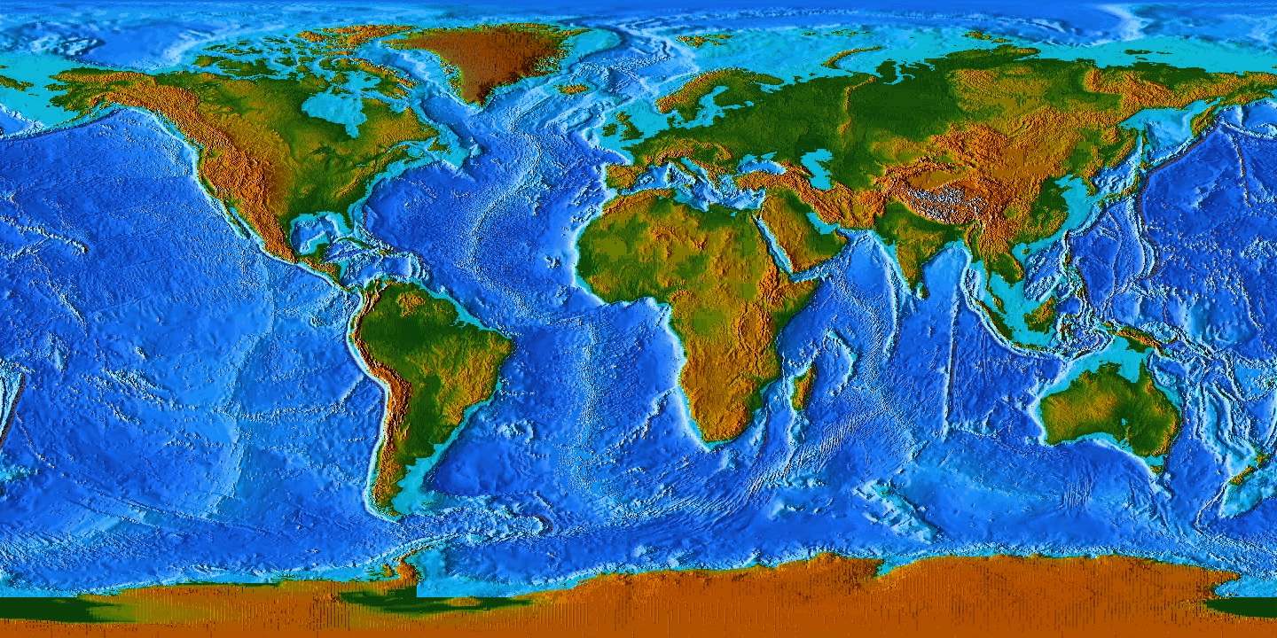
Topographic Map
A topographic map shows details and different elevation levels of an area. It can give you an idea of what the land actually looks like. The map below is a topographic map of the world.
 http://www.seajester.eq8r.net/maps/World_OceanFloor_topo_green_brown_1440x720.jpg
http://www.seajester.eq8r.net/maps/World_OceanFloor_topo_green_brown_1440x720.jpg
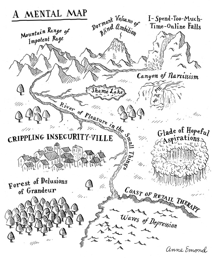
Mental Map
A mental map represents a person's point-of-view perception. I the map below was a comical example of a mental map.
 http://37.media.tumblr.com/tumblr_ltebu0ZREW1qgptbdo1_r1_1280.jpg
http://37.media.tumblr.com/tumblr_ltebu0ZREW1qgptbdo1_r1_1280.jpg
Planimetric Map
Planimetric maps depict horizontal features and are most known as street maps.The planimetric map below is of Newport Beach, California.
 http://woodandmonica.com/images/map2.jpghttp://woodandmonica.com/images/map2.jpg
http://woodandmonica.com/images/map2.jpghttp://woodandmonica.com/images/map2.jpg
Subscribe to:
Comments (Atom)