 http://mainland.cctt.org/mathsummer/josephbond/stemandplots/images/table2.gif
Thursday, April 17, 2014
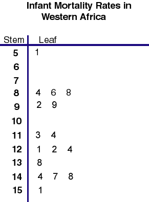
Stem and Leaf Plot
Below is a stem and leaf plot showing infant mortality rates in Western Africa. A stem and leaf plot is a plot where each data value is split into a leaf and a stem.
http://mainland.cctt.org/mathsummer/josephbond/stemandplots/images/table2.gif
http://mainland.cctt.org/mathsummer/josephbond/stemandplots/images/table2.gif
Box Plot
Below is a box plot that shows the annual snow depth at Mathsville Skit Resort. The box plot shows the minimum, first quartile, median, third quartile, and maximum of snow depth.
 https://blogger.googleusercontent.com/img/b/R29vZ2xl/AVvXsEhqWu22YmScW6h43mIYrihd8bHcvfiVtHcBCWI3K9hAwjFNRibZMazVc14zVHxc70hTToO75Q6TuwDca55ZVpnX-eLKwp6MgtAovMeMWHb-GsAlgBkKmGED9X0O1cVewg-kwob1jqsB5Mc/s1600/boxplot-2.jpg
https://blogger.googleusercontent.com/img/b/R29vZ2xl/AVvXsEhqWu22YmScW6h43mIYrihd8bHcvfiVtHcBCWI3K9hAwjFNRibZMazVc14zVHxc70hTToO75Q6TuwDca55ZVpnX-eLKwp6MgtAovMeMWHb-GsAlgBkKmGED9X0O1cVewg-kwob1jqsB5Mc/s1600/boxplot-2.jpg
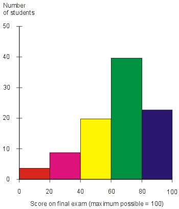
Histogram
The histogram below shows the number of students that scored between a certain score on their exam. A histogram is a diagram that uses rectangles who area is proportional to the frequency of a variable and whose width is equal to the class interval.
 http://cdn.ttgtmedia.com/digitalguide/images/Misc/iw_histogram.gif
http://cdn.ttgtmedia.com/digitalguide/images/Misc/iw_histogram.gif
Parallel Coordinate Graph
A parallel coordinate plot maps each row of data as a line. Each attribute of a row is represented by a point on the line. The parallel coordinate plot below maps a person political preference by age, education, work, race and sex.
 http://static2.xlstat.com/img/tutorials/xpcor3.gif.pagespeed.ic.kzKetCNo53.jpg
http://static2.xlstat.com/img/tutorials/xpcor3.gif.pagespeed.ic.kzKetCNo53.jpg
Triangular Plot
A triangular plot depicts three variables as positions in a triangle. The soil texture plot below shows the percent of different materials that make up soil texture.
 https://blogger.googleusercontent.com/img/b/R29vZ2xl/AVvXsEjZMELzbP6rKB0tUEqfF3WEqnXEETMACzOK9JbId4U29CyTzi4Mh83DhQS0nYHvgnlWEgs3MBbwOUwd1BOTK_ebFeKrxYF6mFZcnzfmMO7e-Ue4RJ-v9LN8TsDZ6ZwCCPkZDCD4gK0OFVfo/s1600/triplot.png
https://blogger.googleusercontent.com/img/b/R29vZ2xl/AVvXsEjZMELzbP6rKB0tUEqfF3WEqnXEETMACzOK9JbId4U29CyTzi4Mh83DhQS0nYHvgnlWEgs3MBbwOUwd1BOTK_ebFeKrxYF6mFZcnzfmMO7e-Ue4RJ-v9LN8TsDZ6ZwCCPkZDCD4gK0OFVfo/s1600/triplot.png
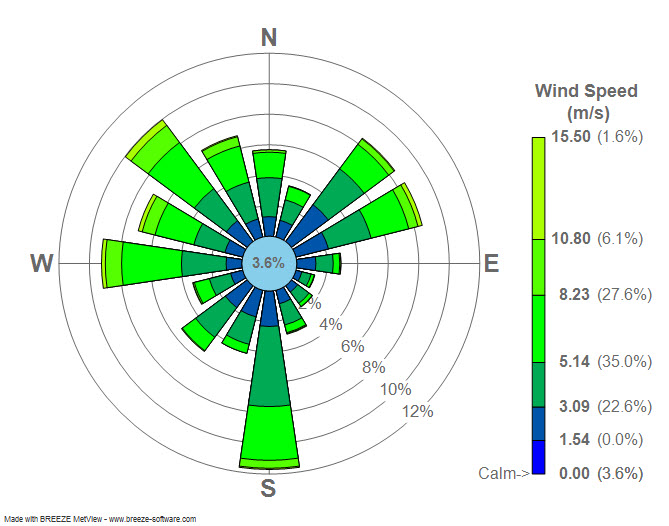
Windrose
Wind rose is used by meteorologists to show wind speed and direction at a particular location. The wind rose plot below shows the wind speed and direction for LaGuardia Airport in New York.
 http://upload.wikimedia.org/wikipedia/commons/7/70/Wind_rose_plot.jpg
http://upload.wikimedia.org/wikipedia/commons/7/70/Wind_rose_plot.jpg
Climograph
A climograph shows monthly average temperature and precipitation at a certain location. Below is a climograph for Boulder, Colorado.
 https://blogger.googleusercontent.com/img/b/R29vZ2xl/AVvXsEg50xjP482VsuLJpsAzyi3JSn7S_cMEaOLBXOLB8XPIHLoMQD2IiJ4c28qyODCfKYsondZFLi8CoVovuumLU_Y5u4rl6TWghT1un9-jXKOz5KR7M3b44Zzgg2sd7-rD4m3TI1QGw6LyKwit/s1600/climograph.gif
https://blogger.googleusercontent.com/img/b/R29vZ2xl/AVvXsEg50xjP482VsuLJpsAzyi3JSn7S_cMEaOLBXOLB8XPIHLoMQD2IiJ4c28qyODCfKYsondZFLi8CoVovuumLU_Y5u4rl6TWghT1un9-jXKOz5KR7M3b44Zzgg2sd7-rD4m3TI1QGw6LyKwit/s1600/climograph.gif
Subscribe to:
Comments (Atom)